Earlier today we launched the new design for our Community Forum.
We hope you like it, if you have any questions, issues or suggestions please let us know here.
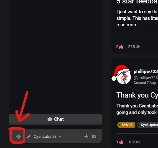
You can change between Light/Dark mode via this button at the bottom left of your screen, if on mobile click the menu button on the right. You can also set this in your user preferences.

Many thanks for your continued support!
PS: Expect some improvements/tweaks to the website (not forum) in the coming weeks/months
Scott
EDIT: i’m aware of some issues with the “Categories” page, these will be fixed soon™️